Wednesday, 27 March 2013

Corrections to my 3rd Article


After receiving really useful information from m assessor I decided to only make small changes to my third article. I was told by my assessor that the images would stand out and look more affective wit borders. I took this advice into account and put tin 3pt borders around each image. The borders I chose were the same sea green colour as the mast head and the break out box on this page. I chose this colour as it conotates the great outdoors and is a gender neutral colour. I have tried to keep the structured grid effect consistent throughout my entire magazine and I think that the borders on this article make this article more structural and grid like.
I didn’t really make any other changes n this article although I did look at the spacing on some of my text and play around with the size of some quotes. I feel overall that I created this article up to a high standard as it was one of the only articles I took inspiration from a professional magazine. I feel that this made this specific article look more authentic than the rest.

Corrections to my 2nd Article


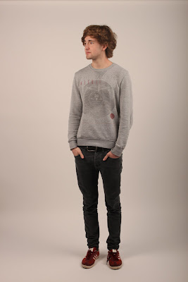
After receiving feedback from my assessor and focus group I decided that this was the article that needed the most improving. My focus group told me that the image was “disappointing and “let the rest of the magazine down”. My main priority for improving this article was to focus on the imagery. I booked a photo shoot at the college’s photo studio. I then organized for one of my friends to be model; I booked at time in the photo studio when we were both free. I wanted the images to be simple so I didn’t include any props or outfits. I took several shots of my model stood up and sat down, so that I had a variety of images to choose from. I used an even lighting when taking my photos I did this by using several light boxes and a DSLR camera. I enjoyed doing the photo shoot as I got a range of in focus images that would help my article. We had a lot of freedom in the photo shoot I felt relaxed as there wasn’t anyone watching, I therefore was able to give my model clear instructions without being embarrassed. My model also felt more at ease doing the photo shoot with no one watching, this made the photos look more natural. After hearing some feedback from my peers they said that the new imagery “really improved e article” and made it look “really vibrant and youthful”. They also mentioned that the imagery “invited you into the article and made you want to read the text”.

Other changes I made to the article were I decreased the size of the mast head as my assessor said it was “a waste of space”. I agree that it looks more effective with a smaller font and I used the extra space to show my imagery. 

I also removed the previous image tat I ad and made the second page entirely dedicated to the text. So I increased the text size to 11.5pt. This made the text easier to read as some of my focus group said they “had difficultly reading the text”. I also changed the font as my assessor said the font wasn’t consistent with the feel of my magazine. I changed it from Times New Roman to Calibri and I feel that this change has made the article feel more youthful than it was previously. 

As I received positive feedback about the interview itself I decided not o change any of the text. After reading the interview my focus group said they thought the article “has a really positive feel” and “it makes you want to start Kayaking”. I feel that the changes I have made to the article have really improved it and made the magazine feel much more consistent is quality.

Tuesday, 26 March 2013

Corrections to my 1st Article


After getting audience feedback from a focus group of my target audience and talking to my assessor I received helpful advice on how I can improve each one of my products. My first article didn’t need that much improving. The things that I were told to improve were.
  •   Introduce more of the colour green (this connotates the great outdoors and would make the article more interesting to read)
  • Take the drop caps off the beginning of each paragraph
  •  Make the images larger (my focus group said there was too much white space)
I feel that my new and improved article is better than my first one. I feel that it looks more professional and authentic. I only made slight changes to this article because I received mainly positive feedback for this one. It has taken me a while to sort the layout of this article out. I kept changing it, but I think I am finally happy with the layout. If I had more time I would have improved the imagery on this article by taking some more photos in the college’s studio. This might have made my magazine look more professional.


Monday, 25 March 2013

Corrections to my Contents Page


After creating my magazine I printed it out and had a focus group with 6 members of my target audience. I received really useful feedback with positive and negative thoughts about my product and suggested improvements that I could make.

I made corrections to my contents page so that it looked consistent. I used the bright orange for the title of this page and I increased the amount of wording on the page. I tried to add more interest to the page by adding more detail to the articles. I wrote a small description of each article to encourage the reader to look at the certain articles. My focus group gave me feedback to reduce the amount of images in the grid. I reduced it from 9 to 6.

Tuesday, 19 March 2013

Manipulating my pictures from Photoshoot 3


 In my third photo shoot I took photos of my model for my 2nd article. I wanted the images to be simple so I didn’t include any props or outfits. I took several shots of my model stood up and sat down, so that I had a variety of images to choose from. I used a even lighting when taking my photos I did this by using several light boxes and a DSLR camera. My model stood in the centre of the studio to make sure that the lighting was even and he didn’t look too pale. I enjoyed doing the photo shoot as I got a range of in focus images that would help my article.

 I manipulated my images by using Photoshop. I manipulated them so that they look higher quality than if I just inserted them straight onto my article. My 2nd article has got a white background and as the article has got a relaxed vibe I didn’t want the images to have borders. I wanted the images to look free on the page. Also I believe that they look much more professional with a white background. I selected three images that I wanted to use in my article. I looked for the lighting on each of the images and at the eyes to select the best three. I then got rid of the background by selecting th e magic want tool on Photoshop and selecting the area around my model, i held down the shift key until the entire background was selected. I then chose the rubber tool and changed the brush sixe to large. I then erased the background until it was all white. To make the images the right colour I used the brightness and contrast tool to experiment with the brightness of my model.