Monday, 25 February 2013

Mock up Contents Page

For my contents page I took inspiration from a magazine called DOR. For one of their contents pages they used postitnotes toput th information about what was in the magazine. I tried to do this for my magazine. Altough when I took the pictures they didn’t look as effective as i would have wanted so i decided to scrap that idea and stick tomy original flat plan contents page.


I wasn’t impressed with the lighting that was produced on this shoot. As I took this photo at home I didn’t have any professional lighting equipment. I used lamps and main lights but they were as effective as if I had used professional light boxes in a studio. The background of the post its looks really dark and doesn’t fit in with the bright youthful vibe of the rest of my magazine. I tried to manipulate this image by taking away the dark background and replacing it with a bright background but this made the post its look fake and it didn’t look as effective as I would have liked. 

I decided to stick more with my original flat plan for my contents page and I feel this was much more effective and worked so much better.


Friday, 15 February 2013

Monitoring Log Week Beginning - 11/02/13

This week is ideally planned to finish off my products and make sure that everything is ready to be uploaded to Moodle. I have left a spare lesson on Thursday to finish off my product if I run out of time.

To make sure that any small corrections are done I asked a few of my friends to go through my articles and check whether or not there was any spelling mistakes. This helped me spot mistakes that I otherwise wouldn’t have noticed.

Over all I think that my schedule has helped me plan my time better although I didn’t allocate enough time for certain things and I didn’t stick to the guide as well as I should have. Although I didn’t stick to my schedule as much as I should have I did everything in the same order and still managed to upload my product or the deadline.

Monday, 11 February 2013

Manipulating my images from Photoshoot 2


The backgrounds of each of my photos looks slightly cream and discoloured, as I wanted white backgrounds for each of my products I decided to increase the brightness of each of my images. By using the magic wand selection tool on Photoshop I selected the product and erased the background to make it white. This was the difference in each of my images. It made them all look brighter and more vibrant. They fit in better with my genre of magazine as the dull images made the article look dark and sad, when in fact it’s quite a happy article. The bright images look better on the page and look more professional.


Sunday, 10 February 2013

Images from 2nd Photoshoot


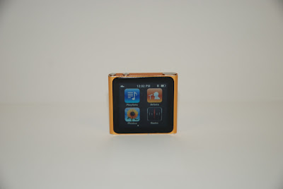
I have had my second photo shoot in the college’s studio and it was successful. I took pictures of a chalk bag, a pair of rock climbing shoes and an iPod nano. All these products featured in my first article. I used a DSLR camera that I borrowed from the college and used a table to take pictures of my products on. I used a white background and an even lighting. I camera automatically focuses on the gadget so that I didn’t have that many blurry images. I experimented with taking pictures from lots of different angles so that I had a range of imagery to choose from. I feel that I could have taken more time on this photo shoot and thought of my placement and exactly what pictures I wanted before I went into the photo shoot. 

When i was on my photoshoot I took a variety of different shots focusing on each poduct at different angles, this gave me a large range of photos that I could choose from for my final product. I disguarded the photos that were blured as they would look unproffessional in  my magazine.  I took images of a chalk bag, ipod nano and climbing shoes.